


From a neoclassical revival to post-modern colours, here are the key winter interior design trends of 2023–2024
Interior design trends are pulling in seemingly opposing directions this season. On the one hand, designers and brands are enchanted by mellow elements, from cocooning curtains to French bistro-inspired homeware. On the other, they are inspired by grittier urban motifs, from mid-century architecture to markings on pavements (the latter to elegant not downtrodden effect). Aside from these rather antithetical styles, we’re witnessing an exciting adventurousness in the design world, with irrepressibly colourful, playful postmodernist accents proving increasingly popular. Effect Magazine fetes five standout trends brightening up the winter months.
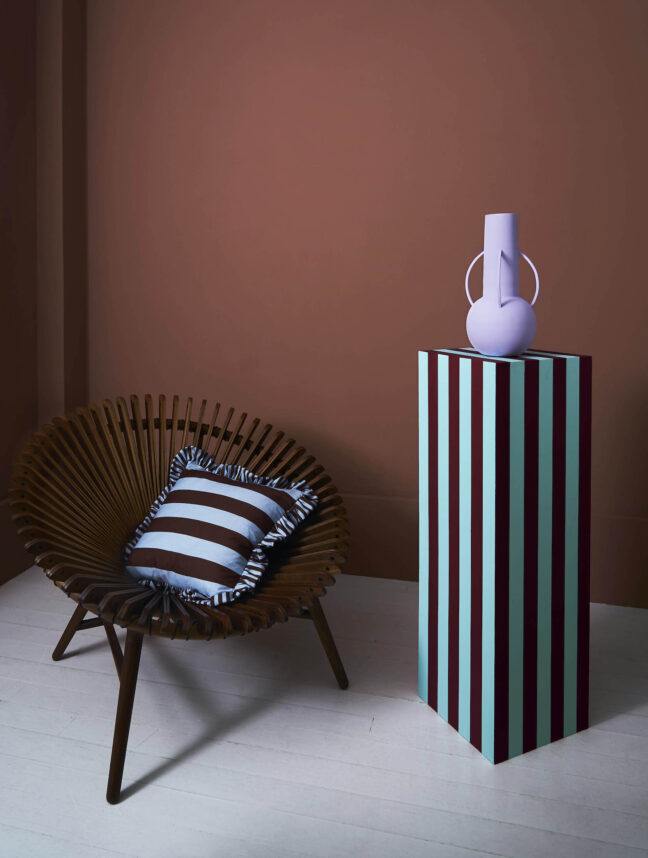
Postmodemist pizazz
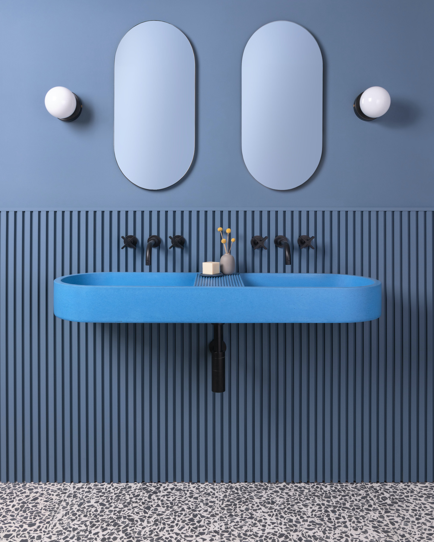
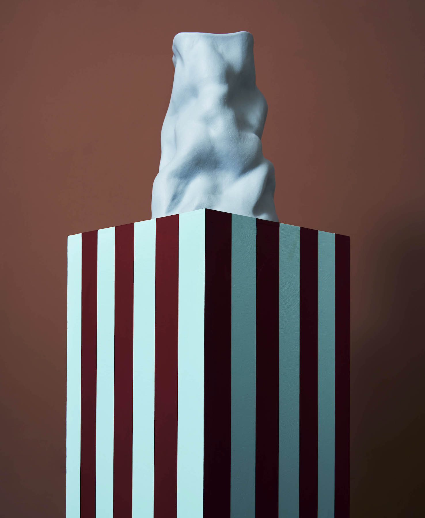
An incontrovertible, ongoing macro-trend in design is for brighter colour in our homes. Surprisingly, this includes washbasins in bathrooms (in theory a risky investment given that it’s possible to tire easily of jazzy colours – and how seldom most of us shell out for new sanitaryware). But with influential designers Bethan Laura Wood and Luke Edward Hall creating colourful bathroom fittings with unabashed panache, it’s a trend that can’t be ignored. The Wave collection by UK company Kast, which specialises in designing and manufacturing concrete washbasins (available in 28 colours), is pretty out-there – the antithesis of the conventional white bathroom staple. “The collection celebrates the allure of undulating forms and whimsical silhouettes,” says Amy Bartlett, Kast’s creative director. And it’s steeped in references to 20th-century design history, she adds, mentioning the curvaceous Alvar Aalto Savoy vase of 1936 and Frank Gehry’s Wiggle chairs of 1972.
Other strong influences behind the collection are Italian Radical Design and Postmodernism, which held sway from the 1960s to the 1980s, says Bartlett, citing experimental Italian design collective Archizoom Associati and Ettore Sottsass, ringleader of 1980s design group Memphis. Tellingly, one Wave washbasin called Prim boasts the quintessentially po-mo colour combo of perky sky blue and lemon yellow.
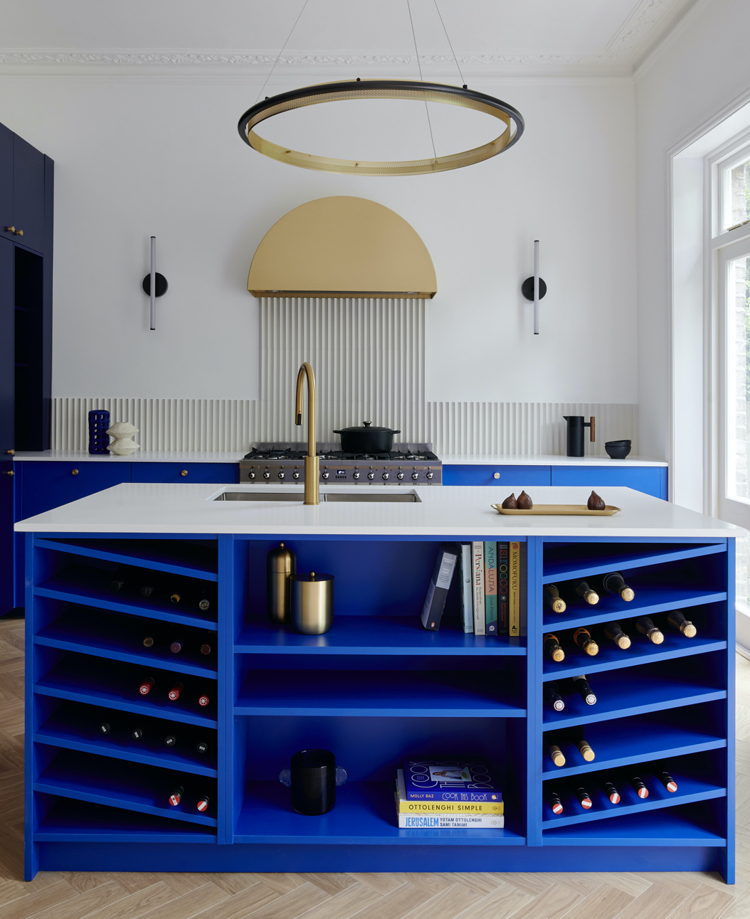
Also channelling the po-mo vibe is London-based kitchen design studio Hølte, which has created bespoke cobalt blue cabinetry for one client in collaboration with ALL Design Studio. Amanda Lyon, founder of ALL Design Studio, chose the electric blue shade as she acknowledges its postmodernist influences, in particular that of Memphis member Nathalie du Pasquier. Fiona Ginnett, Hølte’s co-founder and creative director, says: “This colour blue boasts brilliant reflective properties that contribute to enhancing natural light in a space, making it a very practical choice in a kitchen.”
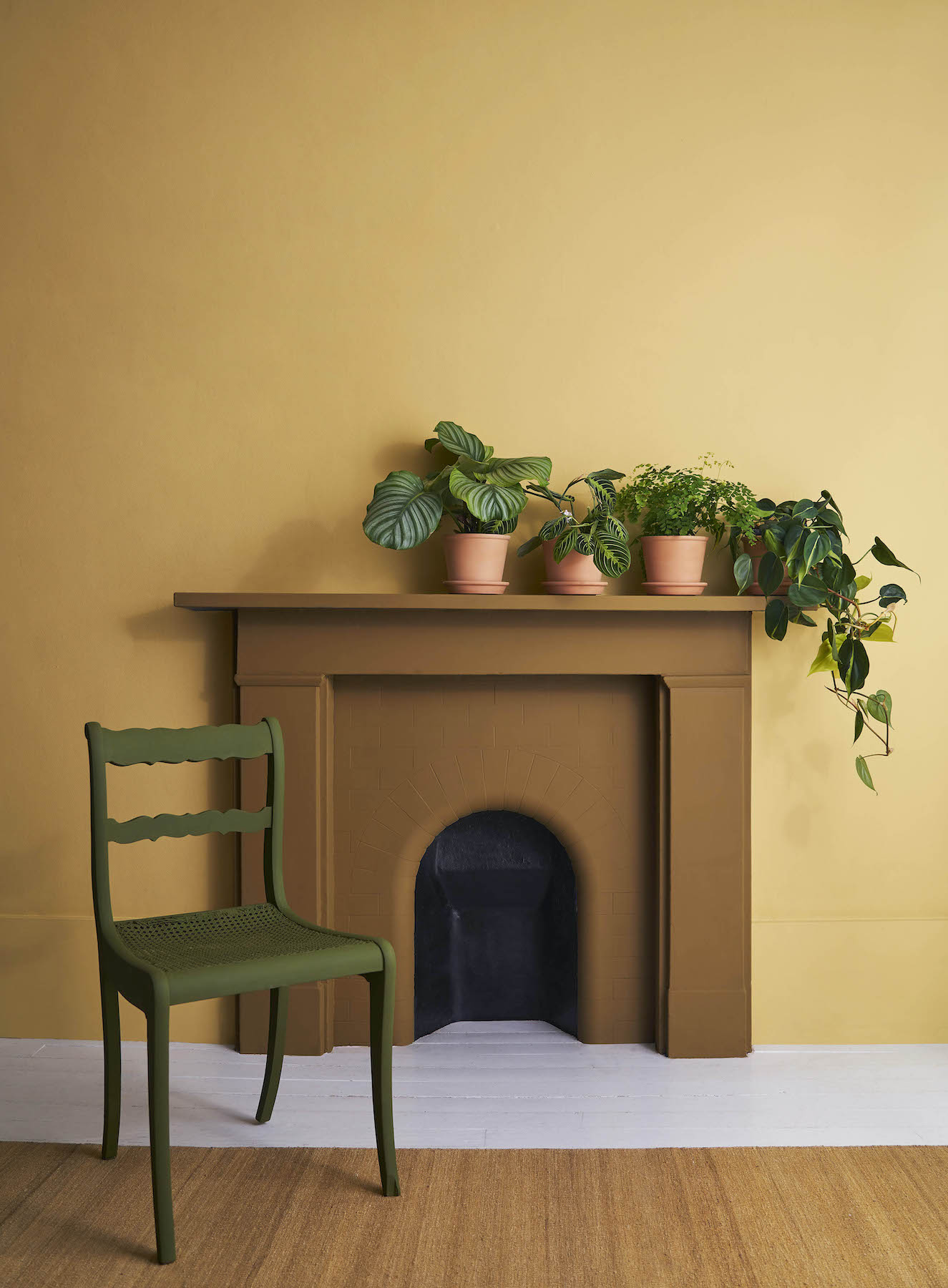
And this winter, Betsy Smith, colour consultant for paint brand Graphenstone, advises enlivening parts of our homes, for example fireplaces and stairwells, with checks and stripes in audacious, contrasting colour combinations.
Textiles with urban motifs
It’s now not unusual to see textiles bearing motifs that are abstracted representations of architecture and overlooked elements in our urban environment. Gill Thorpe’s Verso and Curb rugs for directional, London-based rug company Floor Story are a case in point. The graphic patterns of her Curb rugs nod to her observations of alignments in paving slabs, while the dots on her Verso collection reference manhole covers. “I’ve been documenting the built environment for years,” she says. “I’m drawn to its irregular patterns that usually go unnoticed. With my hand-knotted Verso rugs, I focused on misplaced manhole covers I’ve been photographing across London. My flat-weave, tufted Curb collection draws inspiration from painted road markings skirting pavements.” Interestingly, the resulting effect is painterly rather than overtly industrial: the rugs’ colours are warm, evoking architecture with patina rather than drab urban concrete, and their graphic elements are softened by the rugs’ soft texture.
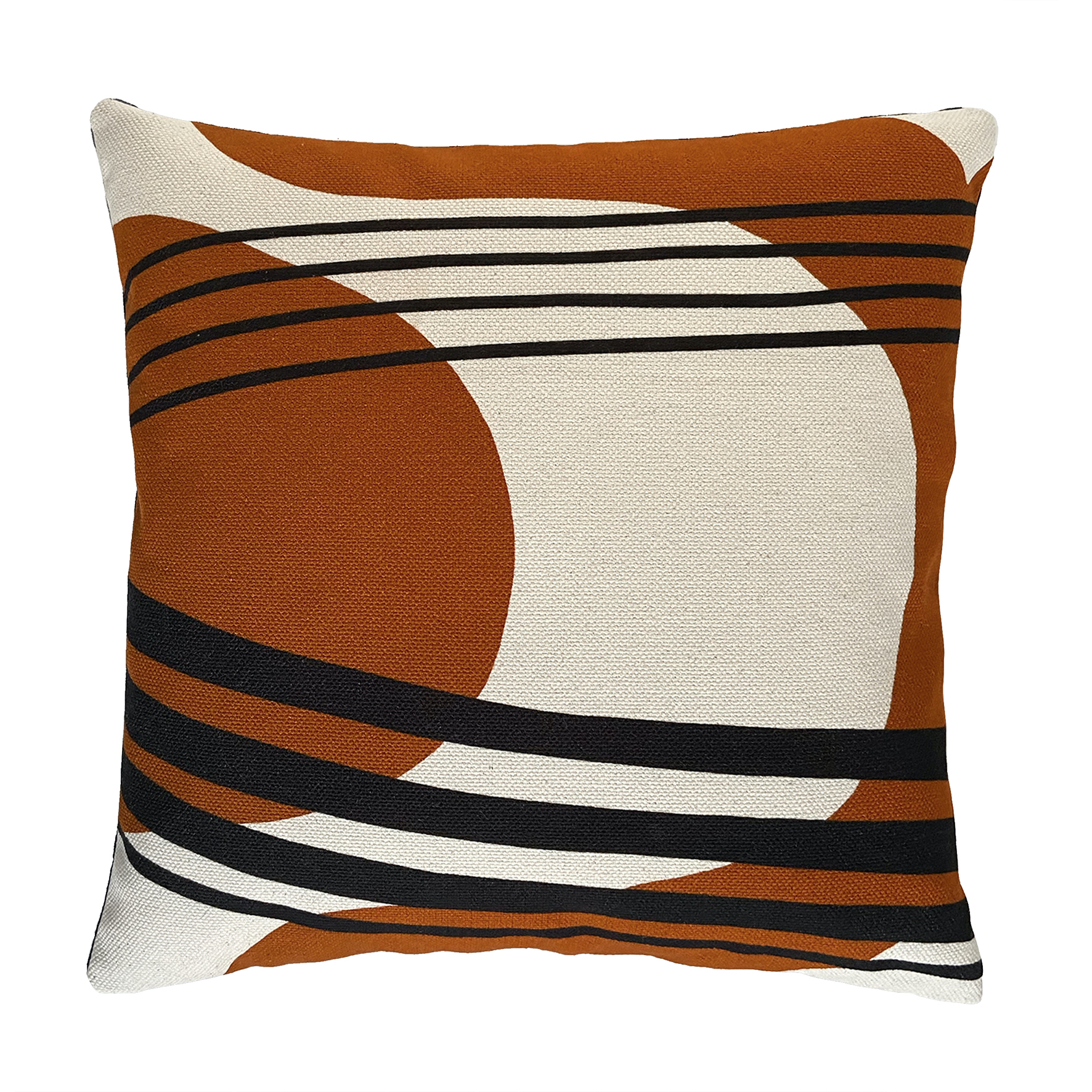
And half-British, half-Iranian designer Eleanor Nadimi’s cushions are covered in textiles inspired by Iranian architecture and mid-century buildings in Palm Springs. Architecture fans will appreciate the specific references her geometric prints make to the latter. One cushion, Maya, is inspired by John Lautner’s flamboyantly futuristic house designed for Bob and Dolores Hope. Ada is inspired by steel-framed houses with butterfly-shaped roofs created by Donald Wexler, and Nell by buildings dreamt up by Emerson Stewart Williams. Another print, Dorsey, captures “the city’s streamlined mid-century architecture in the desert hit by its colourful, pink and purple sunsets”.
Mellow French rusticana
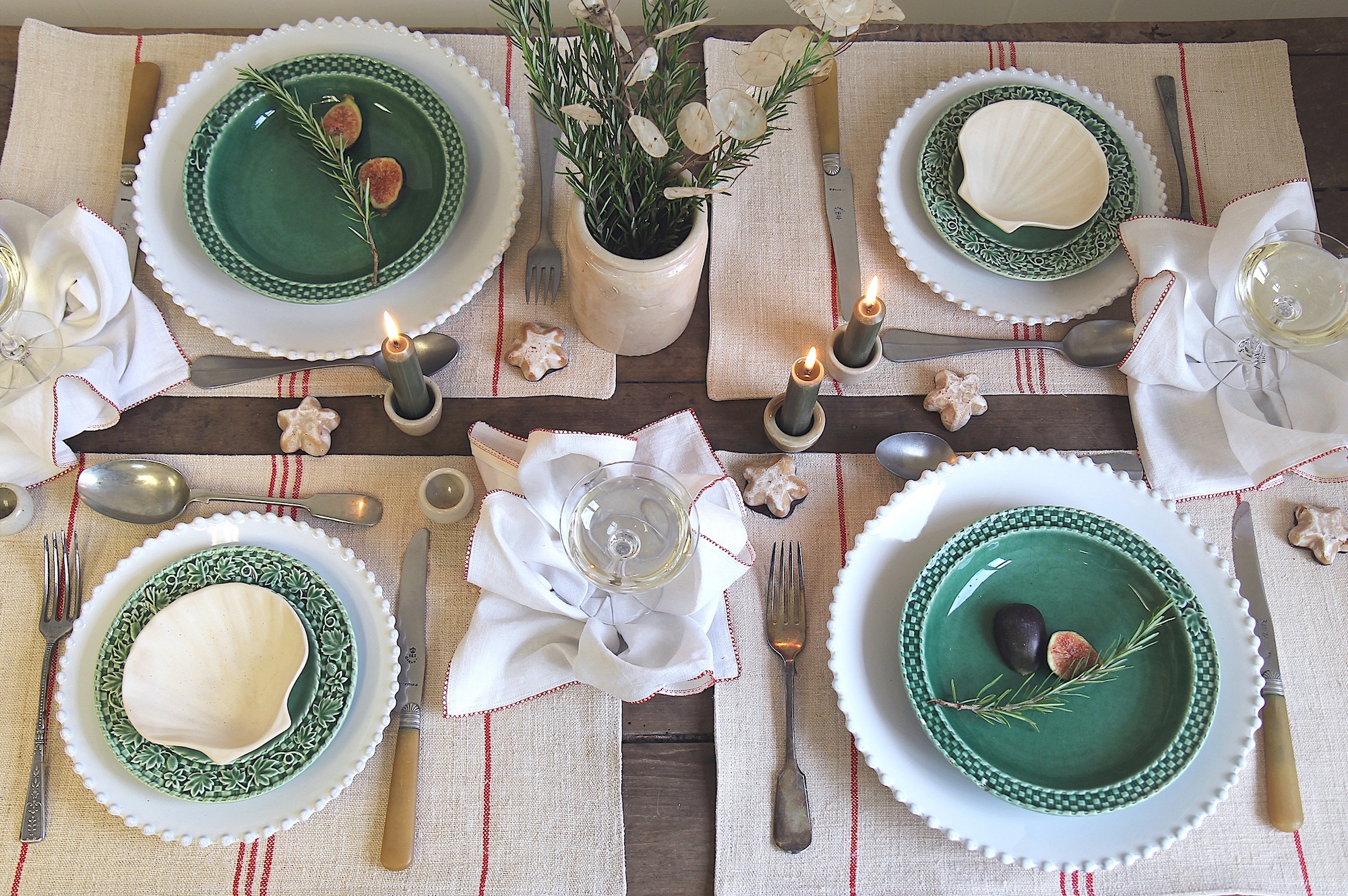
The 1990s saw a trend called, with irony, “granny chic” – think furniture in streamlined shapes with textures mimicking time-honoured crafts (macramé or lace) that looked unmistakeably modern. Now, a similarly comforting though unashamedly romantic, old-world style is gripping the design world – a homage to French bistros and cafés.
Rather than the pop style of 1960s mustard yellow Pernod jugs, we’re talking ecru linen tablecloths and hand-crafted china. Domestic Science, owned by a Francophile Libs Lewis, champions the look with its new Grain Sack collection of table linen made from repurposed red and blue striped grain sacks and antique French linen. “My summers are often spent visiting flea-markets in France, sourcing unique pieces to form our vintage offering,” muses Lewis. “I love the chic, down-to-earth café aesthetic of French bistros – their timeless, functional tableware and white linen tablecloths and sheer café curtains.”
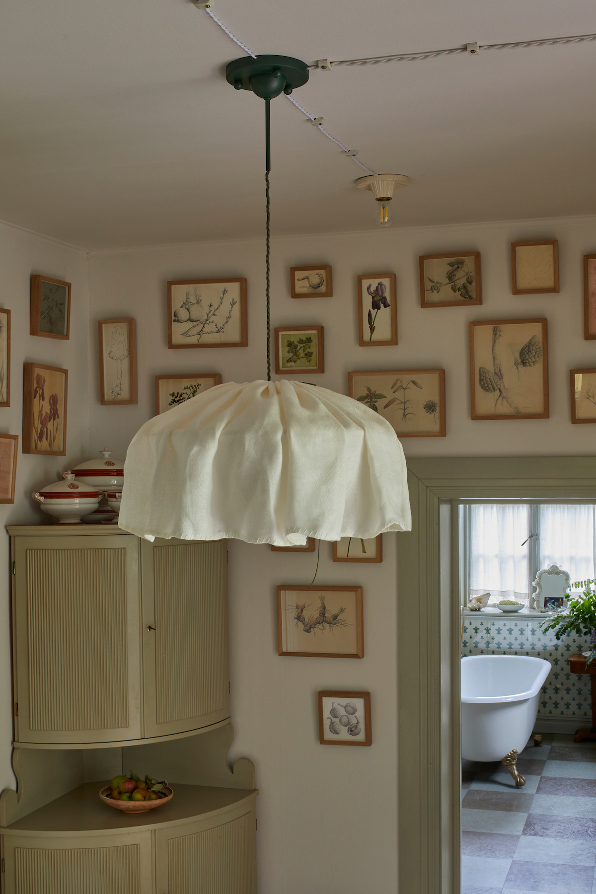
East London Cloth’s café curtains and interior designer Beata Heuman’s Paper Bag lampshades also soften a room’s atmosphere. Made of sheer linen in “butter” or “milk” shades, the latter resemble a loosely gathered skirt and are inspired by fabric shades that softened the harshness of early electric lightbulbs, popularised by Viennese art school the Wiener Werkstätte over a century ago.
Cocooning curtains
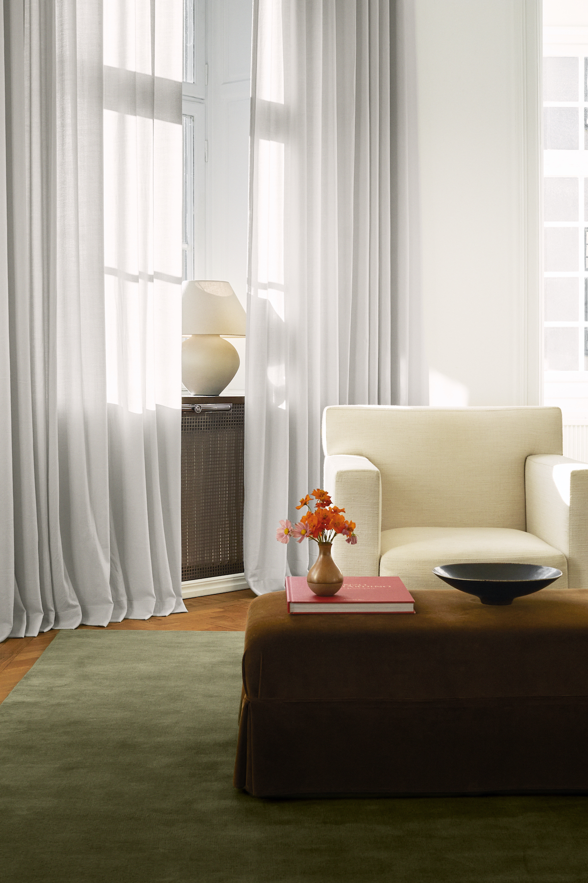
Similarly traditional yet appealing is a growing trend for cocooning wool curtains that keep rooms warm and cosy yet allow soft filtered daylight to enter them. Nicknamed the “blanket approach”, they’re available from Swedish brand Nordic Knots. This style of curtain is also favoured by interior designers Heuman and Rose Uniacke. Not surprisingly, there is a demand for these in Scandinavia where finding solutions to its extreme light conditions is vital. “We wanted to create curtains made purely of wool – a natural, luxurious-looking material providing a beautiful interplay with daylight,” says Liza Laserow, co-founder of Stockholm-based Nordic Knots. “In Scandinavia, we think a lot about light: in winter, we don’t have enough and in summer the sun almost never sets.” Indeed, in Stockholm in January, the sun rises around 9am and sets around 3pm, while in July sunrise is around 4am and sunset around 10pm. While other countries might not be subject to such extremes of darkness and light, everyone can surely benefit from curtains that help insulate rooms without shutting out daylight.
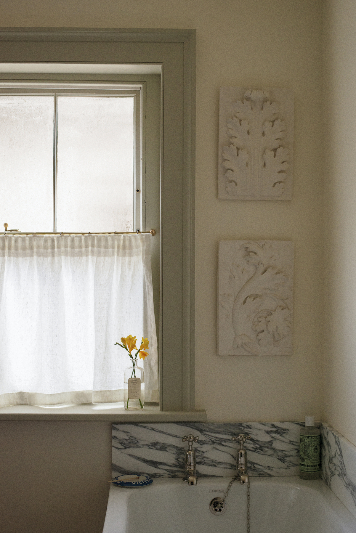
Neoclassicism revisited
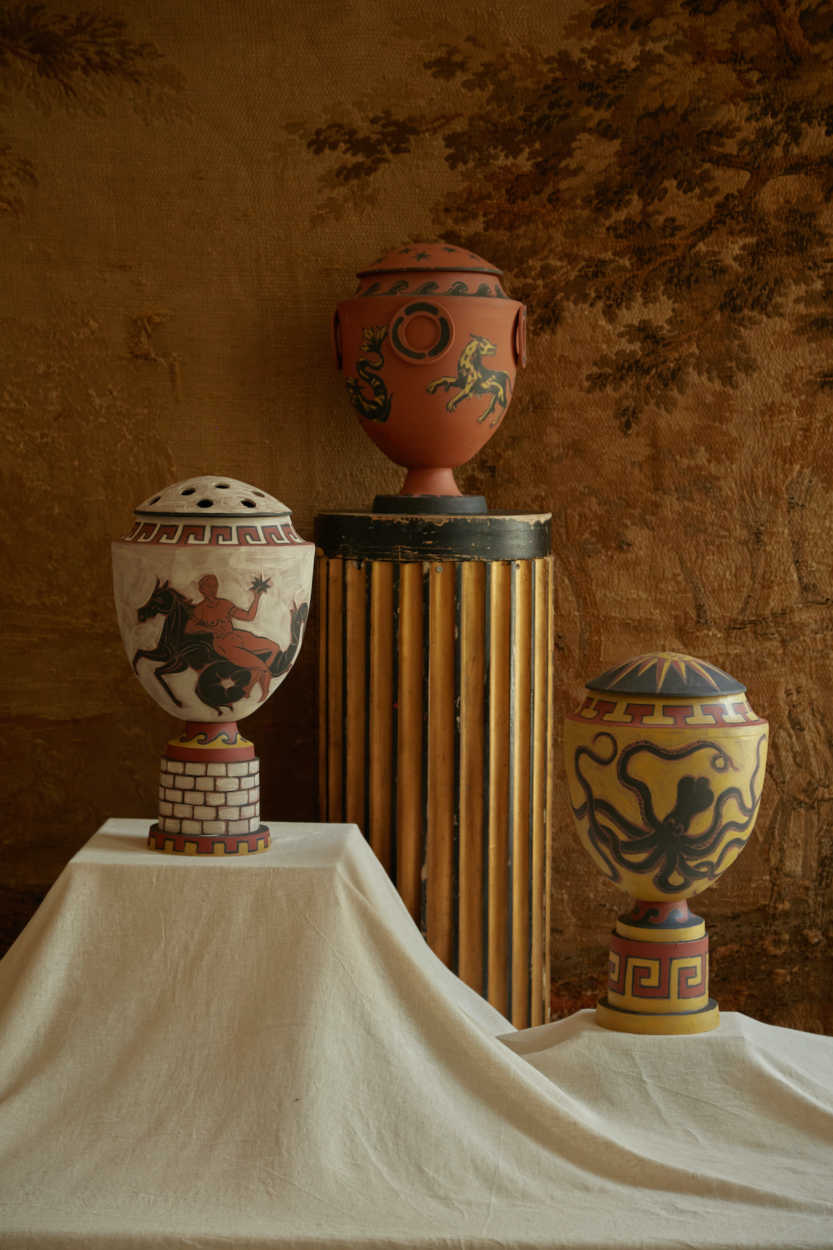
Neoclassicism, a movement that originated in the 18th century and drew inspiration from Classical antiquity, returns to fashion cyclically. In the 1950s, Italian artist and designer Piero Fornasetti’s images of Neoclassical facades adorned cabinets designed by Gio Ponti, with whom he regularly collaborated. Fornasetti enjoyed a revival in the 1980s, when textile design duo Timney Fowler emblazoned their fabrics with Neoclassical motifs.
Today, designers are revisiting the style, very probably because the 1980s is a major influence on younger generations. Gergei Erdei’s opulently decorated designs – including limited-edition ceramic pieces, cushions, platters and art prints – teem with Neoclassical motifs, such as Roman urns framed within Grecian key patterns, “Pompeiian leopards” and Classical columns.
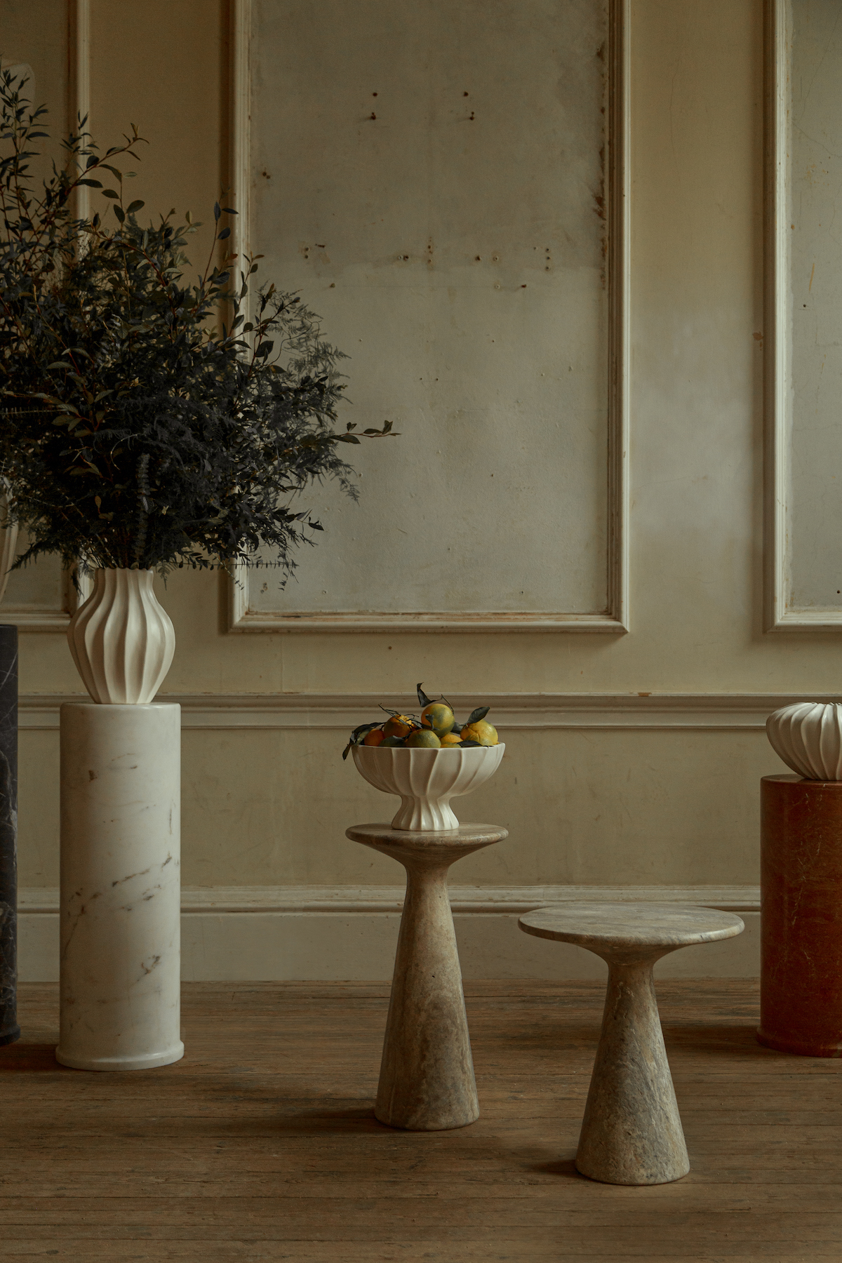
Some brands in sympathy with the style evoke it more laterally. Ransom & Dunn creates simple, sculptural stone and marble tables and plinths in cream, charcoal grey and brown tones redolent of Classical columns and statues. It’s their names, from Juno to Athena, that make the inspiration they take from Ancient Greece and Rome more explicit. “Neoclassicism’s romantic qualities keep drawing us back to it,” says co-founder Johanna Dunn. “For us, it serves as an anchor to which we can add our point of view when it comes to scale, material and finishes, making many of our pieces feel contemporary, while subtly nodding to the classics.”
Read more: Interiors | Trends | Living Rooms | Dining Rooms | Bathrooms | Design