


Be it a deep cherry tone that heightens the drama, a muted rust that evokes an easy-going ambiance, or a flash of tomato red for an injection of bold colour, the use of red accents throughout interior design schemes may often be seen as a risk, but it’s a risk that will pay off.
Confident and characteristic, rich and sensuous, red is a hue that can evoke a number of emotions. Yet while the red lip may have long been associated with the height of glamour, when it comes to interiors, be it out of fear or distaste, both homeowners and designers alike often shy away from its boldness. Until now, that is.
Just last month, colour powerhouse Pantone pointed to Molten Lava as one of fashion’s biggest trends for autumn/winter 2022, and as we know, where fashion goes, interiors follow. Dubbed a ‘fiery red tone whose intensity burns bright,’ red can be as transformative in a home as it can on the catwalk, with many designers agreeing that when used correctly, it is a hue that can lend itself to exaggerated statements.
“For me, all colours have a place in interiors, and this includes red too,” Emma Deterding, founder and creative director of Kelling Designs and KDLoves tells Effect. “It’s all about how and where you use them, as this can really make or break an interior design scheme. If you use red in a balanced way throughout your home, it can work wonderfully and make a real impact.” While perhaps not for wallflowers, it is a colour that is full of power, and there’s no denying it will makes people sit up and take notice when incorporated throughout the home.
It’s a great colour for creating energy and dynamism, and is therefore perfect for social environments.
Emma Deterding, founder & creative director of Kelling Designs and KDLoves
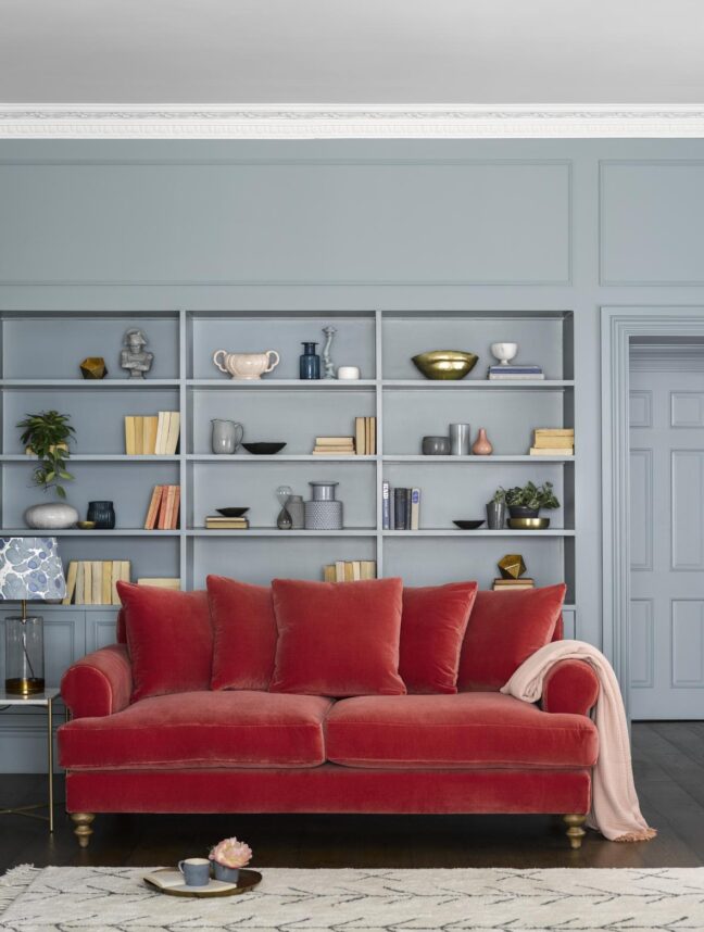
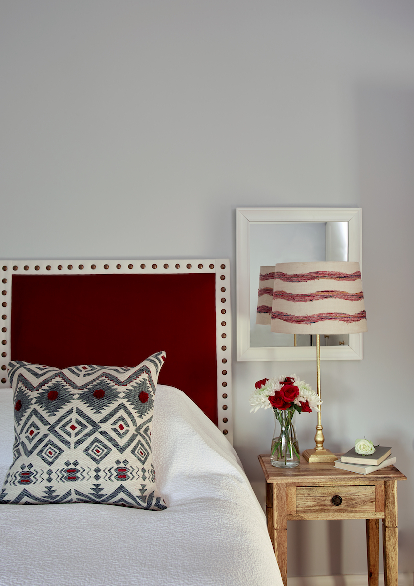
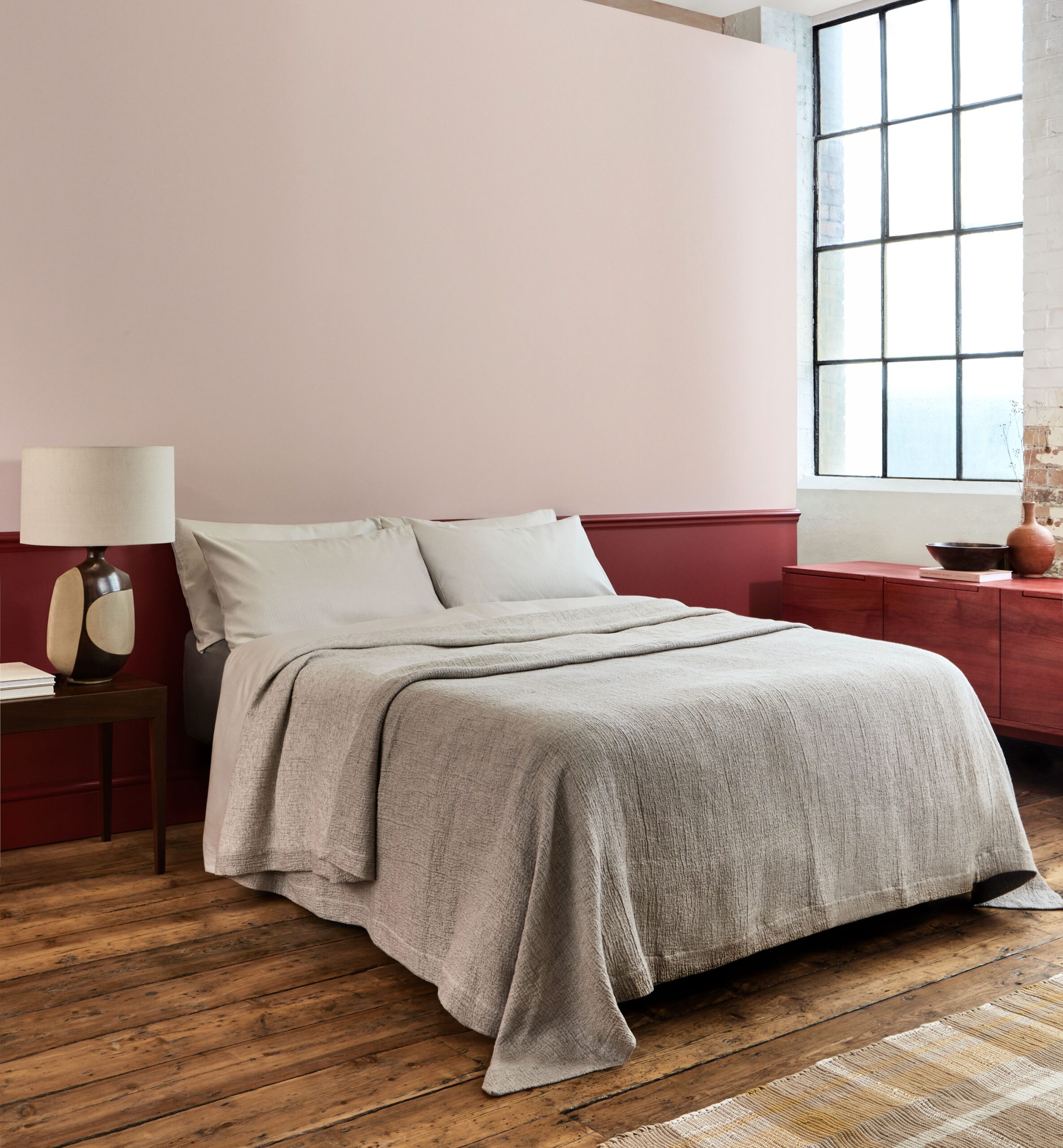
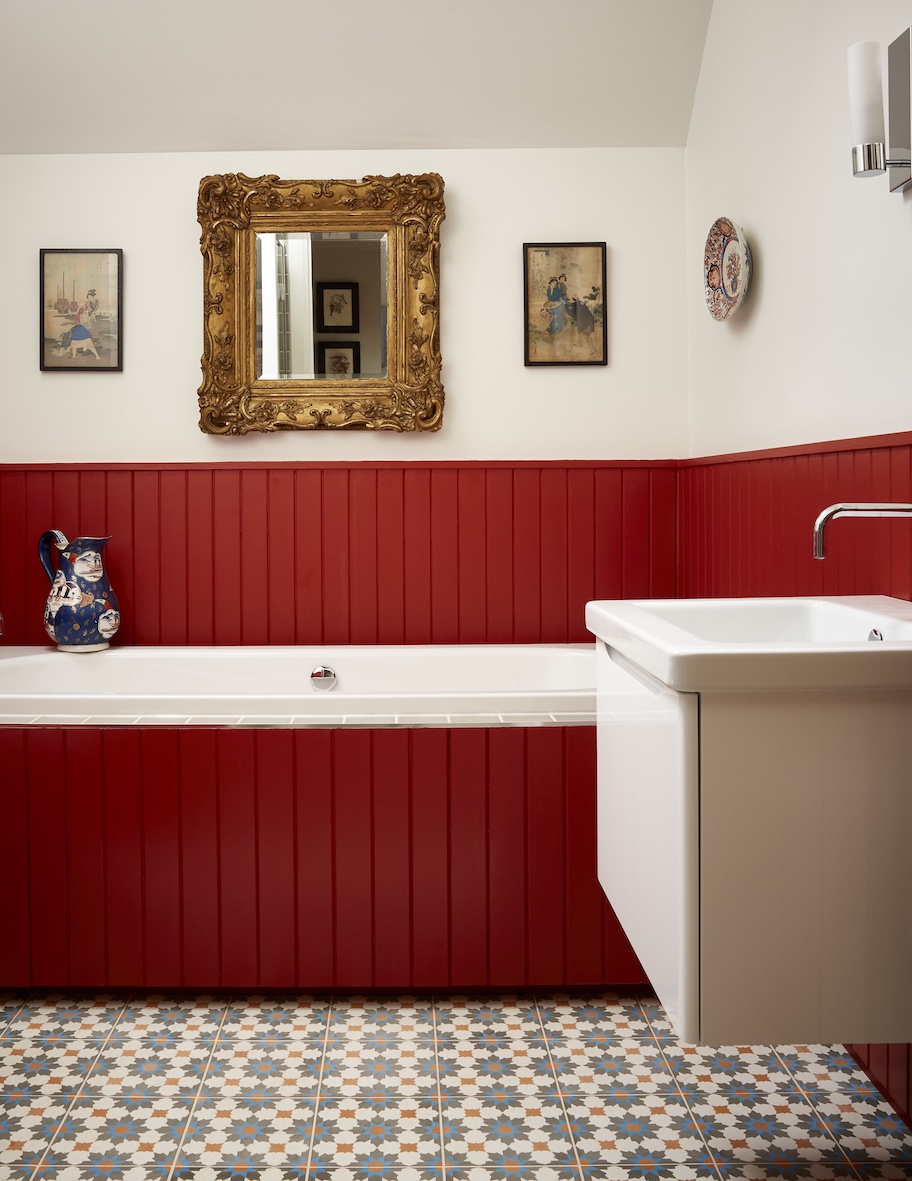
From the deepest garnet to a soft rose, red is often used to liven up a hallway, create a dramatic dining room or add playfulness to a children’s bedroom, and perhaps more often used as a statement wall rather than to fill a full space. “A statement wall is a great way to introduce red to your home before committing to a full room, which may seem overwhelming if it is your first time using the hue,” says Helen Shaw, UK director at Benjamin Moore. “People think of red as a strong vibrant colour, but it can be understated too. It can swing warmer towards sunbaked brick, or cooler towards crimson-kissed violets, providing a muted quality that brings depth and elegance.”
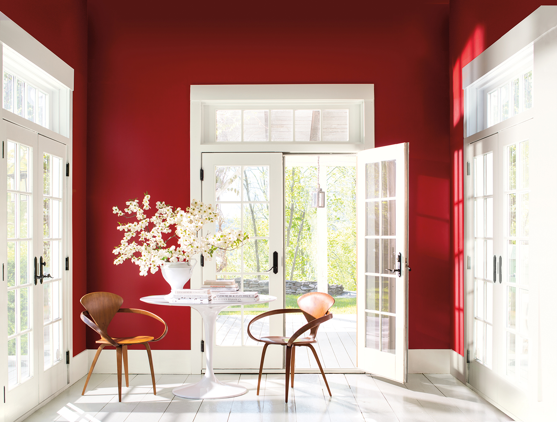
As with all bold hues, the secret to ensuring red doesn’t overpower is to pair with complementary shades, all while taking into account the feeling you want to evoke when spending time in your target room. Beige and red are the perfect pairing to create a rustic charm feel, while those opting for a more maximalist finish might prefer to team the hue with purples or turquoise. “A complementary colour scheme will bring an energising feel, while a monochromatic one will feel harmonious,” adds Shaw. Alternatively, if you’re worried about making the room feel dark, use colour scales to pick a lighter and darker tone in the same family. “Use the lighter tone on the walls and even ceilings, and darker tone on woodwork,” she adds. “This will keep the space feeling bright but will still give you a contemporary look.”
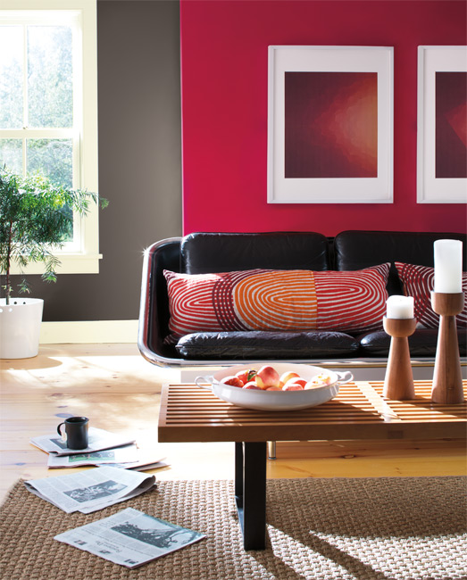
Often lauded as an ideal shade for a dining room, red can be the perfect backdrop for dinner parties, and looks even more effective at night-time against candlelight. “It’s a great colour for creating energy and dynamism, and is therefore perfect for social environments,” advises Deterding. James Arkoulis, creative director at Howark Design agrees, adding that it is a hue best used in spaces where you want to create an impact, but not let it overpower.
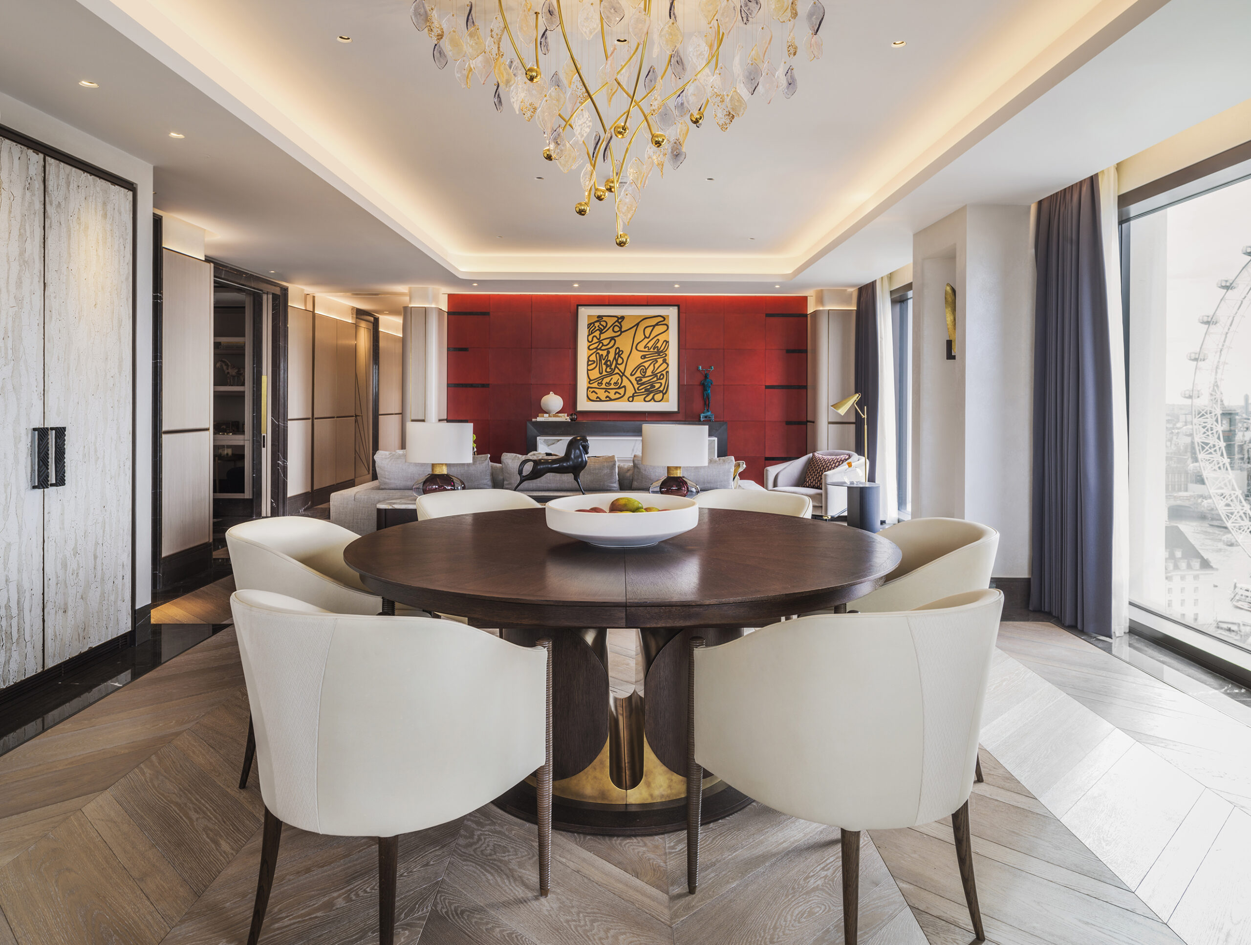
An example of this can be seen at a magnificent private three-bedroom penthouse curated by London-based luxury interior design studio Goddard Littlefair in the capital’s swanky Casson Square. Inspired by key London locations on its skyline, the living room features a striking tomato red parchment wall which clads the surround to the marble and bronze finished fireplace, while elsewhere, two armchairs in claret red velvet balance the strength of its colour. “Ultimately it depends how brave you’re feeling,” adds Arkoulis. “People often say not to use red in bedrooms as it isn’t traditionally seen as a calming colour, but we painted a metal bedstead deep coral red in a bright seaside bedroom and it really lifted the whole room.”
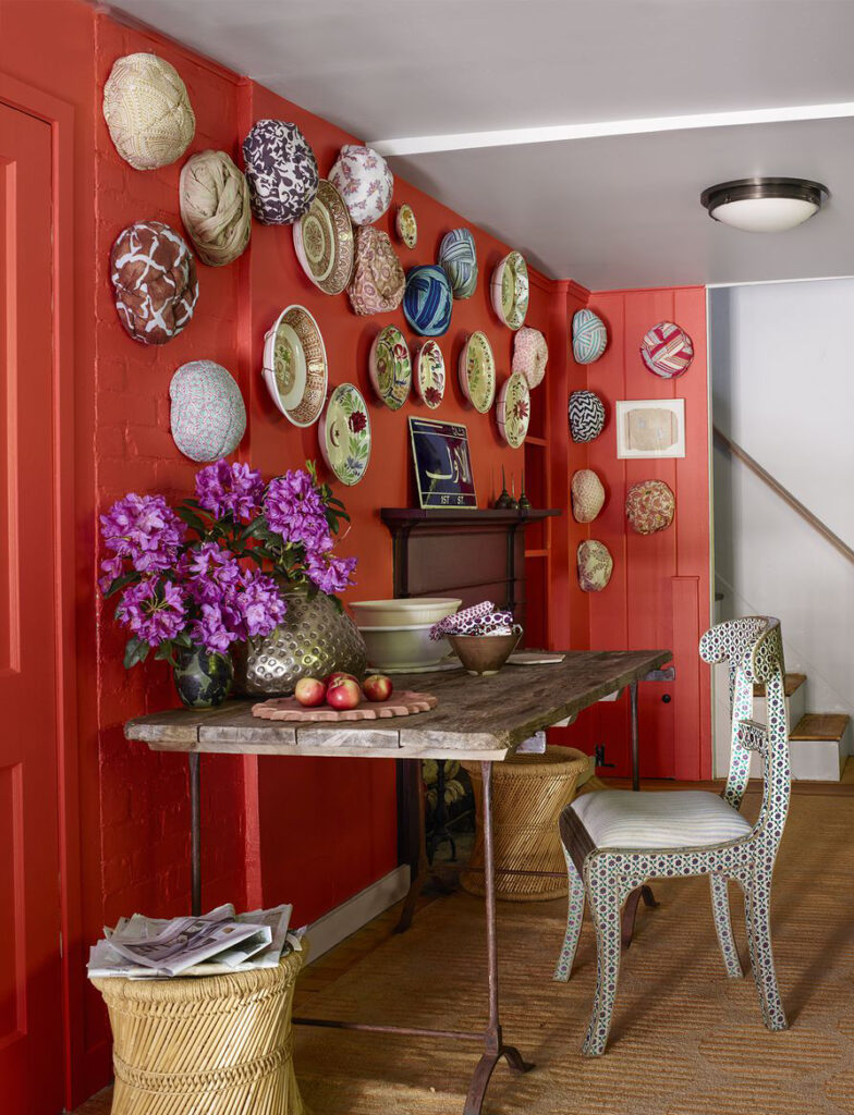
Globe-trotting textiles designer John Robshaw is another tastemaker who is most certainly not one to shy away from the use of signature patterns and colours – just one look inside his vibrant Connecticut country home and you’re hit with an explosion of bold hues and mismatched textures that just add to its eclectic appeal. Not only does his two-tone kitchen feature a beckoning red wall that creates a space that commands attention (it’s painted in Rose Quartz by Benjamin Moore), he has also transformed the kitchen’s corner with a second red wall that makes the for the perfect anchor for Dutch plates he purchased in Sri Lanka and turbans he had made in India as gifts for friends. “I’ve always loved warm reds,” he tells Effect. “They bring in light in an interesting and different way. In Southern India there is a massive spectrum of colour all over the place, from pink houses to neon yellow, so I guess I’m not afraid of any one colour. My house is sort of in the woods and it’s very cozy, so red just felt right to me.”
People think of red as a strong vibrant colour, but it can be understated too.
Helen Shaw, UK director, Benjamin Moore
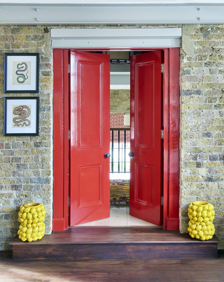
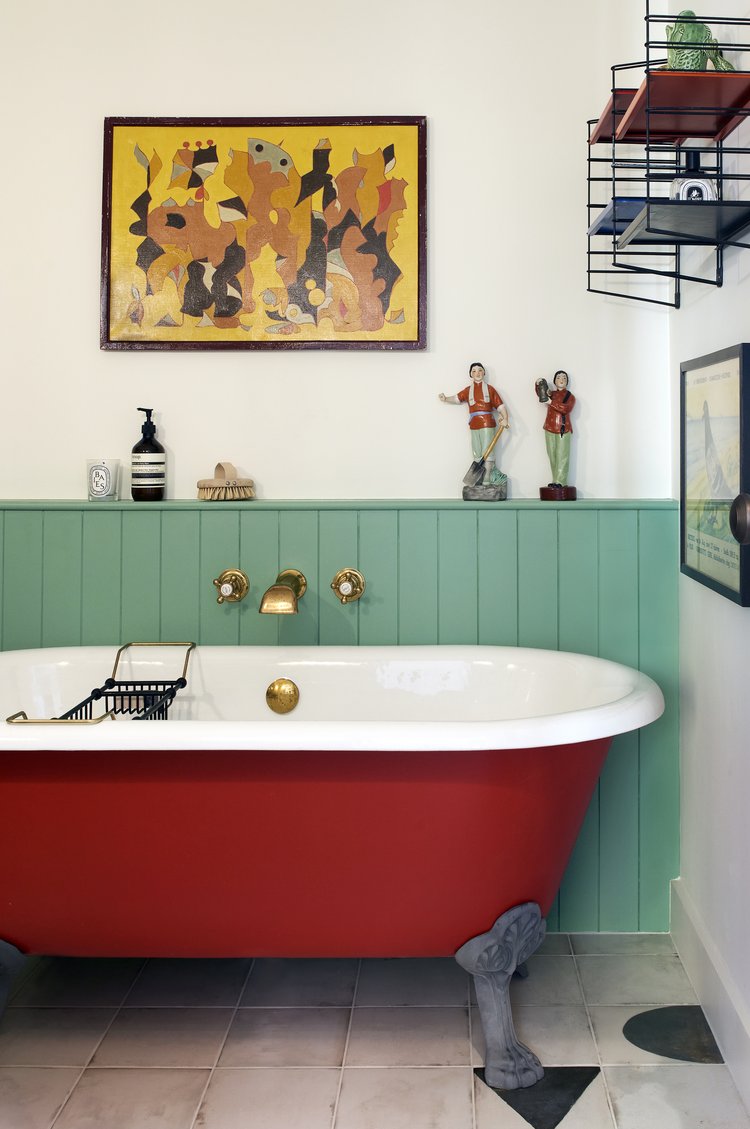
For those not brave enough to transform an entire room, or even opt for a statement wall, furniture and appliances are an alternative yet equally stylish way to introduce the hue into our homes – be it through painted furniture, joinery, sofas, a free-standing bath or statement rug. Arkoulis suggests opting for a red range cooker in a kitchen to create a striking focal point, or small kitchen appliances such as coffee makers or kettles. “Or, if you’re not ready to take the plunge and commit to painting or upholstering in red, try introducing it in art and accessories,” he adds. “A striking print with red will really bring a room to life, and is a great way to start enjoying a bolder colour in your home.”
As for Deterding, she’s all about signature one-off pieces that pack a punch. “A firm favourite piece of furniture of ours is the Julian Chichester Wave cabinet,” she adds. “We absolutely love it as it’s big, bold, and a great storage solution for all your dinks and accessories.” At the end of the day, a hue as intense as scarlet or pillar box red is never going to be for everyone, but if you’re brave enough to work it into your next room makeover, it’s a risk that will most certainly pay dividends. “I think anyone who knows about interior design and is a true designer would never write off red,” concludes Deterding. “Any colour can work in interiors so long as you know how to use it.”
Effect Magazine is brought to you by Effetto